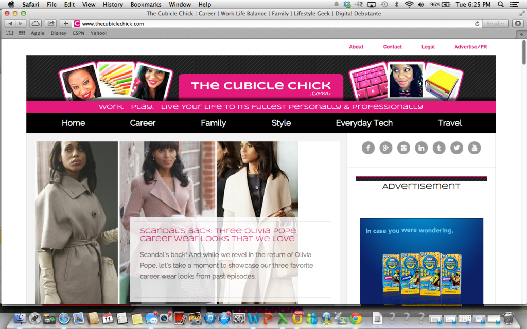
There’s something wonderful about making over your space. For four years now, I’ve called TheCubicleChick.com my home. And each year, I’ve been able to make some improvements here or there. I’ve stayed pretty consistent with the look and feel of my site, but as I’ve grown, I am not sure that my site grew with me. With the changing of the blogging practices, as well online trends and items that I’ve taken notice of, I knew it was time to overhaul my website from the inside out, giving a much more professional, yet fabulous online space some of you have come to love.
I wanted something that not only could represent my brand well, but my readers too. You’ve come to look at the site for informative articles regarding career, work/life management, family, technology, and so much more—so I wanted to have a cleaner design that is easy to read, navigate, and share with others.
I hope you like the new look and feel of my new digs. The site is also now back to being mobile friendly (something many of you told me was lacking in the previous design). You will be able to read the site perfectly no matter if you are on your desktop, laptop, smartphone, or tablet.
The site is now easier to read, navigate and use. Please mosey around my new digs and make yourself at home.


Love the redesign and the tagline says all. Really feeling the new digs.
Thanks so much, Val. The overhaul was long overdue. Loving it so far 🙂