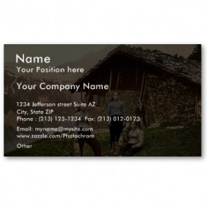
 Even in the digital and technological age, most career driven professionals use business cards. A business card is one of the most important tools one can have while networking and making moves. It is a way that we legitimize ourselves as true movers and shakers. When you ask someone for their business card and they don’t have one, it says a lot about that person. It raises questions about their professionalism and business savvy. But have you ever wondered what your business card says about you?
After over ten years of networking and exchanging business cards, I can tell a lot about a person when they give me their card. If the card is well designed and professionally done, it speaks of the person’s creativity and drive for success. If the card is filled with pen scratch outs with corrected information, it says that the person makes a lot of changes, most of which are not permanent. If the business card is simple, it usually speaks of the person who is interested in getting straight down to business.
Your business card should have all of the ways to connect with you, including your first and last name, business address, email address, office phone, wireless number, and email address. If you have a web address, that should also be included. And the trend now is to include your social networks on the card as well.
One of the biggest mistakes one can make is passing out a business card with rampant misspellings and incorrect information. Not everyone will notice if the mistake is small, but as a former human resources manager, I notice even the smallest of details. I cannot count the times that I have used a business card someone gave me in order to go to their website and got an error because the web address is incorrect. Make sure when you have your business card made that you have it proofread by an additional eye, just in case they are able to point out an error you fail to see.
Another mistake many make with their business card is it is too busy to read. The font is fancy, and type is small, and makes for a hard time trying to contact someone. Make sure your business card is branded, but don’t go overboard.
And if you have more than one business, try making a double-sided card with each business on each side—trying to fit all of your hustles on one card can be difficult.
There are also options for electronic business cards that are becoming more and more popular. The V-card option in Microsoft Outlook that can be exchanged online, is the most popular e-business card currently.
Business cards are still a very popular method of connecting with people with whom you’d like to do business with. Make sure your card is on it’s “A” game before it’s presented, and make a positive statement when networking.
This article was originally posted in my HR Column on Young Black Professionals Guide


All very good tips. I just ordered new business cards from Moo and I hope the quality lives up to the hype. So now you’ve piqued my curiosity…what does your business card look like? 😉
Whitney, my card is a front and back card, but I will take a picture of the front of it and share with you on Google+. How’s that? Also,I heard that Moo makes great cards. I had my designed by my graphic designer and made through Zazzle. There are a lot of companies who are making fabulous business cards these days.
Great post! I agree on all points (except…b/c I ‘live’ in the digital sphere, I don’t have a mailing address on my cards.)
P.S.
Moo’s cards are awesome – very good quality. But I would avoid the mini-Moos b/c they can be annoying to hold onto and will get lost amongst regular sized business cards.
My current cards are from Zazzle too! great customer service.
Thanks for the comment Justice Fergie. I understand about not wanting to put your physical address on your cards. I have a virtual office address for that reason. And I agree, those mini cards are hard to keep up with. Cute and fun, but not very practical.
Great tips. I’ve been needing new cards for a while. I like the idea of the double sided card.